
In 2013, Oracle conducted a research study among executives regarding the state of their customer experience initiatives. The study found that while 91% of the respondents wished to be a CX leader in their industry, only 37% said they were just getting started with a formal CX initiative and 20% considered their CX initiative, “advanced”. While I’m hopeful a lot has changed in the past 8 years, I fear it hasn’t as organizations continue to struggle with integrating customer and employee experience strategies fully into their DNA.
To achieve an industry leading customer-centered focus in an organization, the experience can’t be an initiative or program. Rather, it must be a part of each business function and every decision made daily. Frequently, the inability for an organization to achieve this full integration is related to the lack of “skin in the game” by its leaders and frontline employees. As Peter Drucker said, “If you can’t measure it, you can’t improve it”. (Peter Drucker didn’t say – what gets measured gets managed, contrary to popular lore). So perhaps measuring performance is a good place to start allowing us to focus on better customer and employee experiences?
No this is not another article about how to measure CX in your organization. There’s plenty of content in the CX world about NPS, CXi, CSAT, CES, Loyalty, Retention, etc. This article focuses on how we bring together all the various metrics within an organization to paint a picture of its performance at delivering better experiences. First let’s distinguish between metrics and measurements.
A Measurement is an indication of the size, quantity, amount, or dimension of a particular attribute of a product or process. … A Metric is a measurement of the degree that any attribute belongs to a system, product, or process. For example, the number of errors per person hours would be a metric.
I often and incorrectly use these inter-changeably, so I thought it was worthy of clearly defining the difference between the two. Many organizations look at customer metrics such as those mentioned above as its primary metric to understand how they are performing against customer expectations. While that’s certainly a reasonable approach, I think it lets us see only part of the picture of an organization’s performance. To illustrate my point, let’s look at an example.
I think we can all agree that customer service agents are the most “measured” employees in an organization. The voluminous amounts of data generated from call management systems measure an agent’s performance in talk time, after call work, availability, adherence, quality, accuracy and so on. As a leader in many contact centers, I gradually evolved my thinking towards creating two types of metric categories for our contact center agents – performance and health metrics.
While average handle time was a frequently used performance indicator for agents, it can be better used as a health metric. Longer handle times perhaps indicate an agent needs more training, shorter ones may indicate an agent’s accuracy level (a performance measurement) is at risk. Combining the two types of metrics helped connect the dots for agents so they knew improving their health metrics would have a corresponding improvement in their performance metrics. Agents were now given a roadmap for how to manage their own performance and leaders could spend more time on coaching to desired behaviors and improvements versus reprimanding them on why they weren’t achieving an average handle time target.
This approach of combining metrics to paint a picture can be applied in an organization using a dashboard made up of 4 key metrics: Financial; Operational; Customer and Employee. Like a balanced scorecard, the chart below illustrates the slightly modified approach:
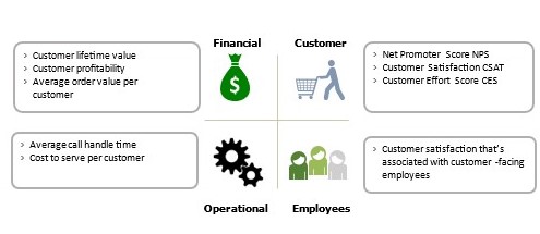
Instead of looking only at your NPS score, look at how measurements within the other 3 metrics are performing for any given period.
- Is there a relationship between a decline in NPS and your customer retention percentage?
- Are your employee engagement scores declining while average attrition is climbing, and your contact center agent error ratios are increasing?
- Are operational shipping delays causing noticeable and negative impacts to your customer satisfaction scores?
- Is your cost to serve individual customer segments in line with the allocation of resources throughout the organization?
It’s these linkages that can dramatically expand an organization’s view of how it’s performing against customer expectations. The measurements I’ve included in each box are for illustrative purposes only. You can insert your organization’s current or desired measurements so employees at all levels in all functions can better understand the linkages. Then, when various functions create their own dashboards to align to the overall view, you’ll build momentum, buy-in and a desire to ensure the metrics are moving in the right direction as a unified team not disparate departments.
If you’ve been thinking of creating a unifying dashboard such as the one, I’ve suggested, here are a few tips to keep in mind:
- Don’t overcomplicate the process initially. Look instead for one or two established measurements in each category and use those to paint the first picture. Remember, start with paint by numbers but strive to be a Rembrandt.
- Ensure the measurements you’re using are universally and easily understood within the organization. If you must explain the definition of the number as opposed to why the number is moving in a particular direction, it’s probably the wrong number to use.
- Share with the entire organization and then prepare for the inevitable questions and thirst for more information. You can offset this somewhat with proactively providing an initial trend analysis to prompt discussion.
- Resist the urge to broaden the dashboard, deep dive into the numbers and expand the measurements. Remember, the intent is to align the organization and improve your customer and employee experience. Keeping that intent in mind will help build support for your efforts.
Regardless of what you call it – connecting the dots or painting the picture, using dashboards can help your organization be more customer-focused and achieve not only its customer metrics but its operational, financial and employee ones as well.


